The first time I learned about design systems was at a workshop in Boulder in 2012.
The facilitator walked us through using Bootstrap. Afterwards I asked him if his company used Bootstrap. He said,
"Not Bootstrap. We've built something similar but custom."
I thought that sounded like a lot of work.
It wasn't until I spent the next five years meandering through our SaaS app that I realized how much work it must've saved.
With Bundlify, we started with a design system. This style guide is the MVP of our MVP. Took us a week. Will save us years.
Here's how you can create one just like it…
A quick note on branding a SaaS company.
When most people think of branding, they think logo, colors, etc.
Jeff Bezos put it best:
"Your brand is what other people say about you when you’re not in the room."
So, yes.
Your brand is viewed through your logo and colors, but it's created through the experience you provide.
In software, you want your brand to be consistent, reliable, and delightful.
Q: As a software company, how do you guarantee a consistent, reliable, and delightful experience?
A: With a design system.
What is a design system and why is it important?
In software, a design system is a set of standards for displaying the visual components—typogpraphy, buttons, colors, forms, panels, pages, etc.—that make up your website or app.
A few years ago the web was abuzz about responsive design—making sure your website displays correctly on all devices.
Now everyone's talking about atomic design—making sure your website or app displays consistently across all pages and components.
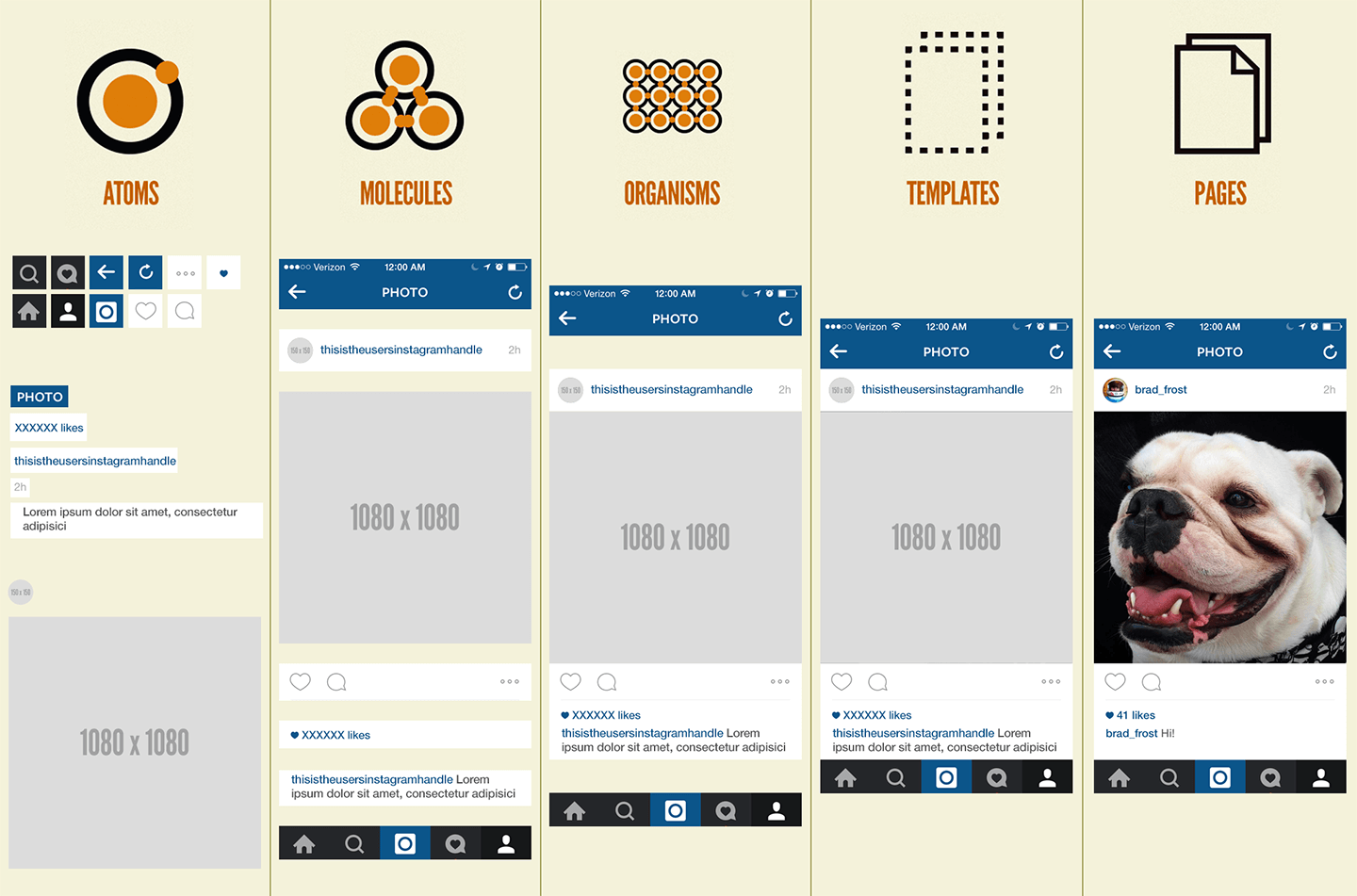
In atomic design, you create the components first. Then the containers that sit in the layout to create the template that makes up the page. From atom to molecule to organism to template to page.
These components are housed in a style guide, also known as a pattern library.
I've mentioned this before, but it's important for a few reasons:
- Consistency in design - Every button, color, input, panel, page layout, etc. is styled exactly the same in every instance, whether you're on the marketing site or the web app.
- Ease of build - No more guessing how things should display on the page. If it's not in the style guide, it's not an option. Plus, it'll grow with us as we introduce new components.
- Shared assets - The style guide is a separate app where we store our CSS, JS, and other assets. If we update the logo, we switch out one file and it propagates everywhere.
- Saves time in development - When components are designed and defined, you don't have to add a bunch of classes to every element. The component has one style regardless of context.
- Quick reference - If we need to design something or create a graphic, we can copy/paste the colors and HTML from the style guide.
- Painless changes - At one point we updated the colors. All we had to do was replace six hex codes in one file and all other colors—for hover, active, text variations, background varitions—were auto-generated.
- Onboarding new people - When we start hiring, they'll have everything they need to follow our brand guidelines without barriers.
Websites are systems, not pages. A style guide helps you define and organize that system.
Who benefits from a design system?
When you establish a design system upfront—or sooner than later—everyone in and around your company will be happier:
- Product owners - Rather than deciding how every new feature should function, the components are already there. No guessing.
- Designers - Instead of designing on a feature-by-feature basis, you design or re-design a component and it gets applied sitewide.
- Developers - No longer have to think about front-end. The components are ready and just need data.
- Copywriters - If you include voice and tone, every ad, email, and landing page becomes consistent.
- Support - As your support staff rolls out docs, the formatting for every headline, list, and call-out is there.
- New hires - Introduce your new hires to your style guide and they can contribute on day one.
- Customers - Consistent, useful, and delightful. They'll love you for it.
Everyone will work faster, more in-sync, and always to a common end. No more guessing. No more duplicating work.
Plus, if done right, it'll all but eliminate technical debt.
What to include and how to create a design system and style guide.
When deciding what to include, it depends on the complexity of your software and the size of your company.
Your style guide should include everything. But if you're just getting started or working with a client, that may be impractical.
Start with the basics and move on to the bonuses as you need them:
- The Foundation - Typography, colors, grid, and logo.
- Base Components - Buttons, forms, panels, navigation, and layout.
- Extra Components - Tables, alerts, icons, modals, etc.
- Bonuses - Internationalization, text utilities, and blank states.
Keep in mind, a style guide is a living document that's meant to be updated and added to over time.
Start with typography, colors, grid, and logo.
Every website—regardless of complexity—is made up of typography, colors, a grid, and a logo.
Typography
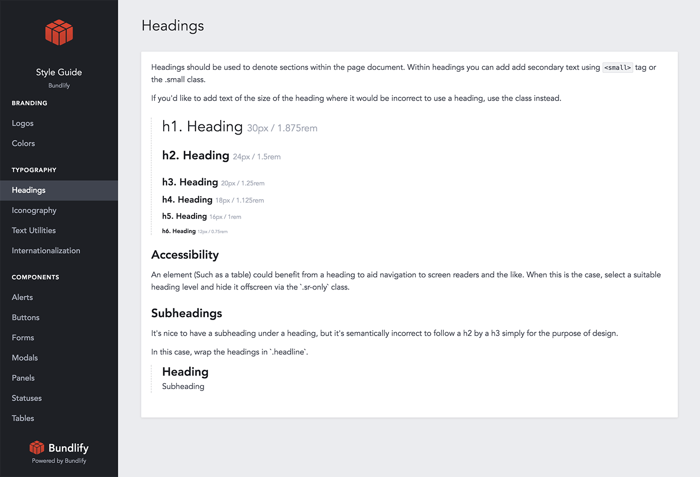
Define the font family, size, line height, and margin bottom for your headlines and body copy.
We're using Avenir with a Helvetica fall-back. Our base font size is 16px/1rem and our base line height is 1.618. Our headlines scale up from there.
Colors
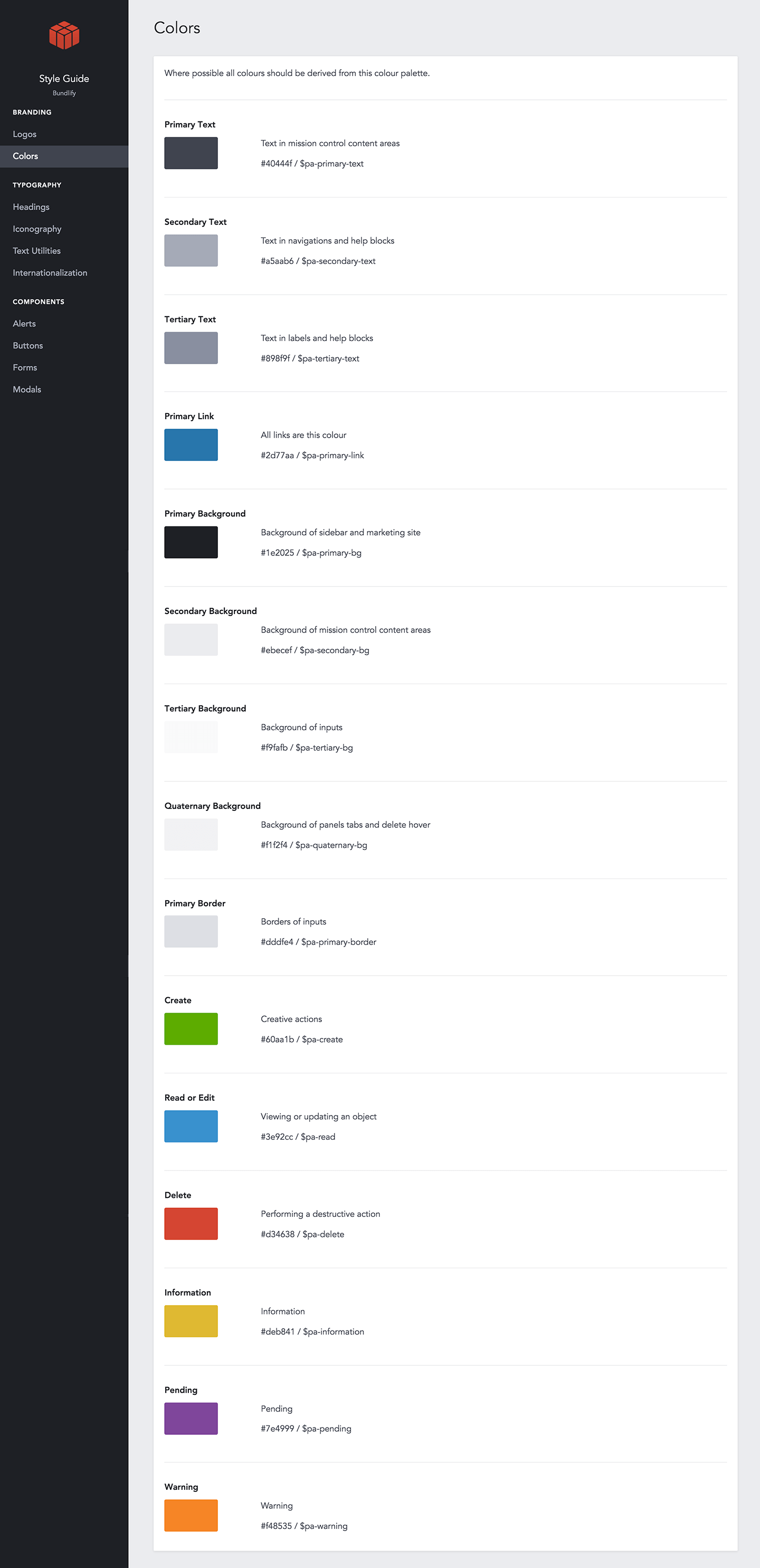
For a marketing site, you'll need shades of grey for your typography and backgrounds plus one or two accent colors.
For a SaaS app, you'll need more colors for the positive (usually green), negative (usually red), and informative (blue, yellow, or orange) actions.
We're using eight shades of grey that are all generated as percentages lighter or darker than the primary text color: #40444f. Plus, we've established our create, read/edit, delete, information, pending, and warning colors.
Grid
You need to decide what type of grid you want to use. How many columns? Gutter width? Container widths?
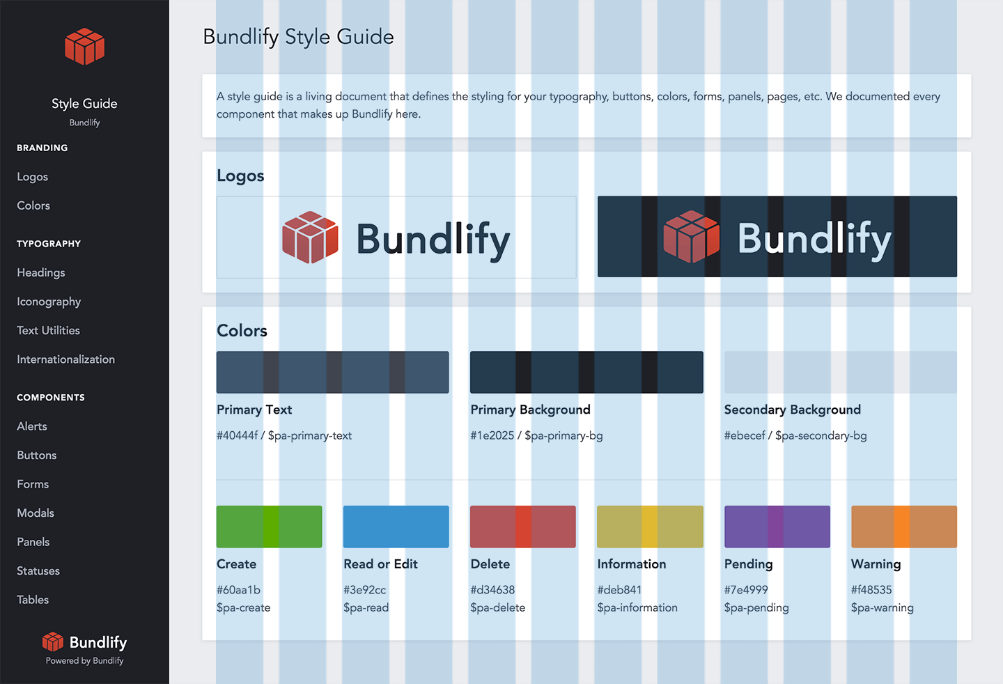
We're using the default Bootstrap grid. 12 columns. 30px gutters. And the container width is fluid depending on screen size.
Logo
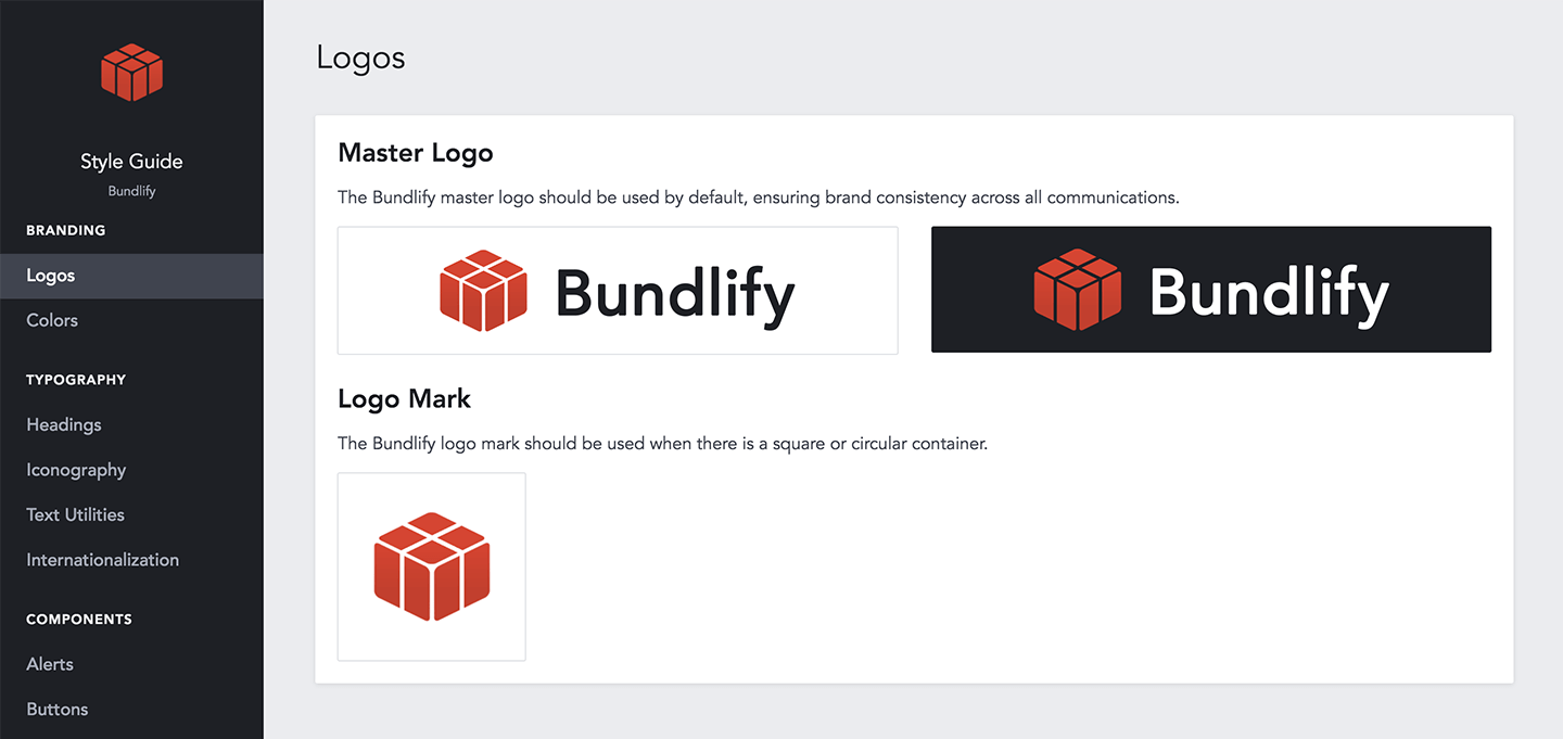
You'll use your logo in various places on-site, in social media, and press mentions. It's important to provide the files for your official logo.
We have a light version (for dark backgrounds), a dark version (for light backgrounds), and a logo mark for square or circular containers.
Design buttons, forms, panels, navigation, and layout.
Once you have the basics, you'll want to establish the base components that make your site usable.
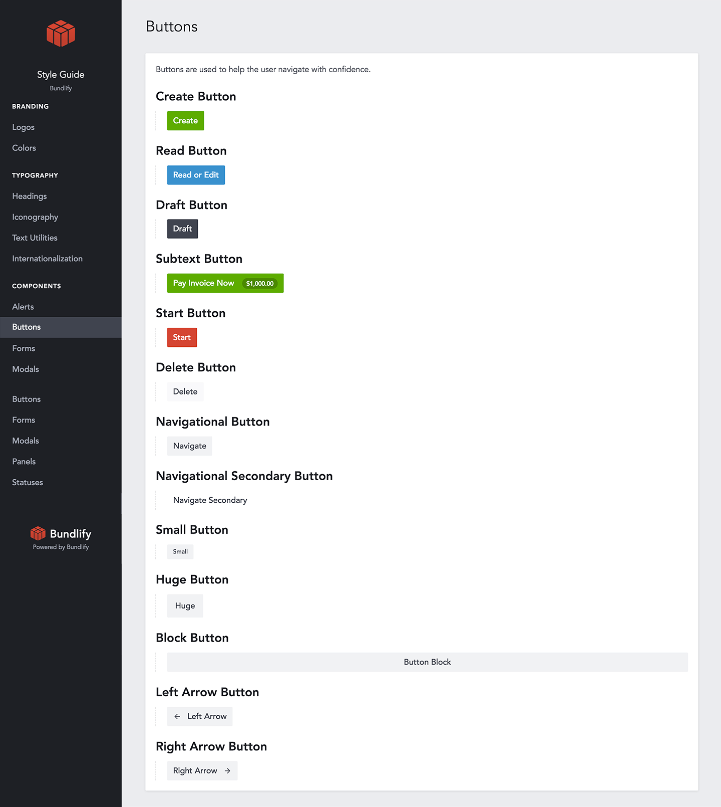
Buttons
At a minimum, you need a button styling for the main call-to-action with default, hover, and active states.
We've documented 13 button types that serve different purposes and in different containers.
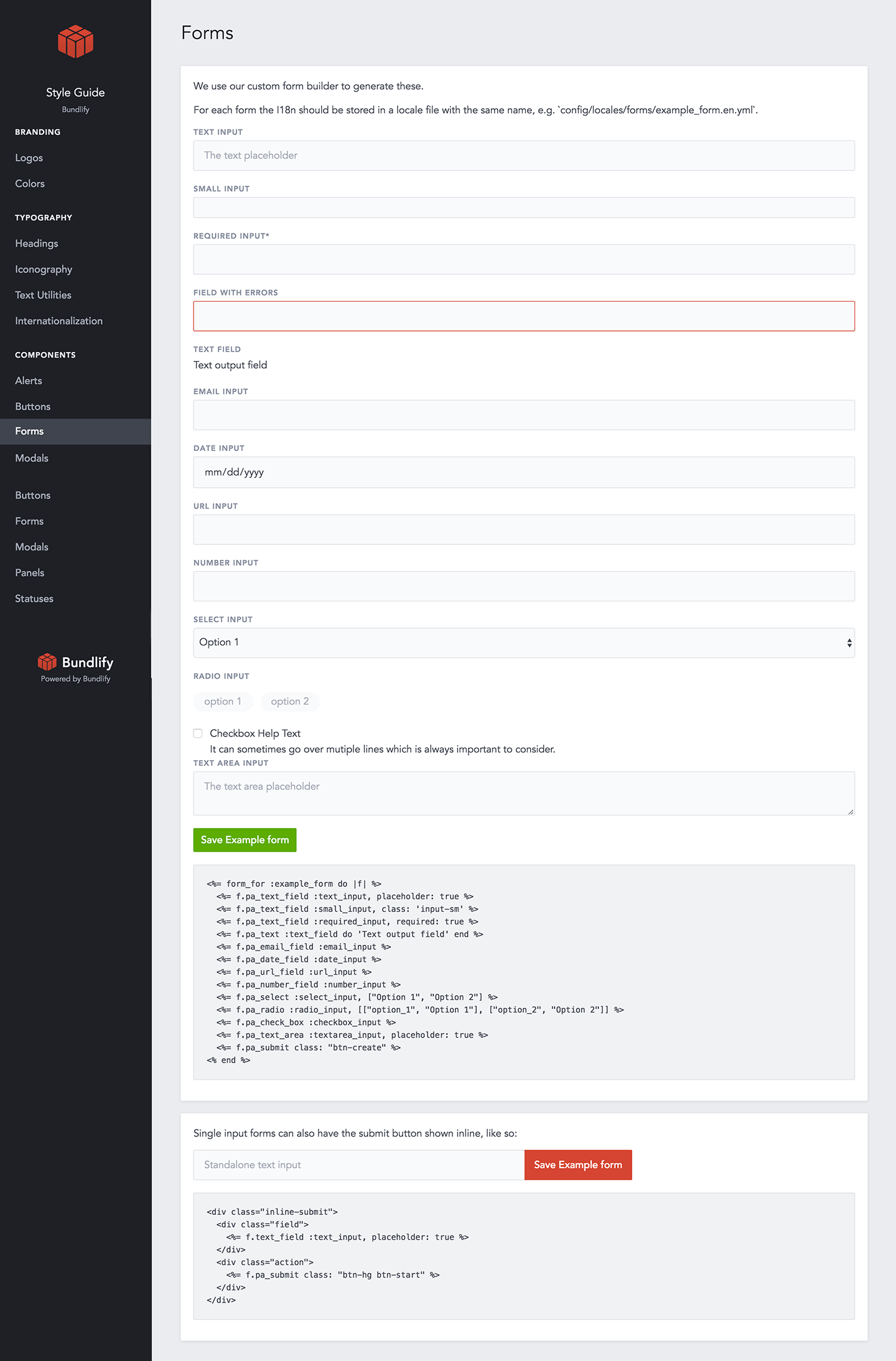
Forms
Forms are made up of labels, inputs, text areas, select fields, checkboxes, and radio buttons. Each of these components should be consistently designed.
We also documented date, URL, number, and a standalone input with an inline button.
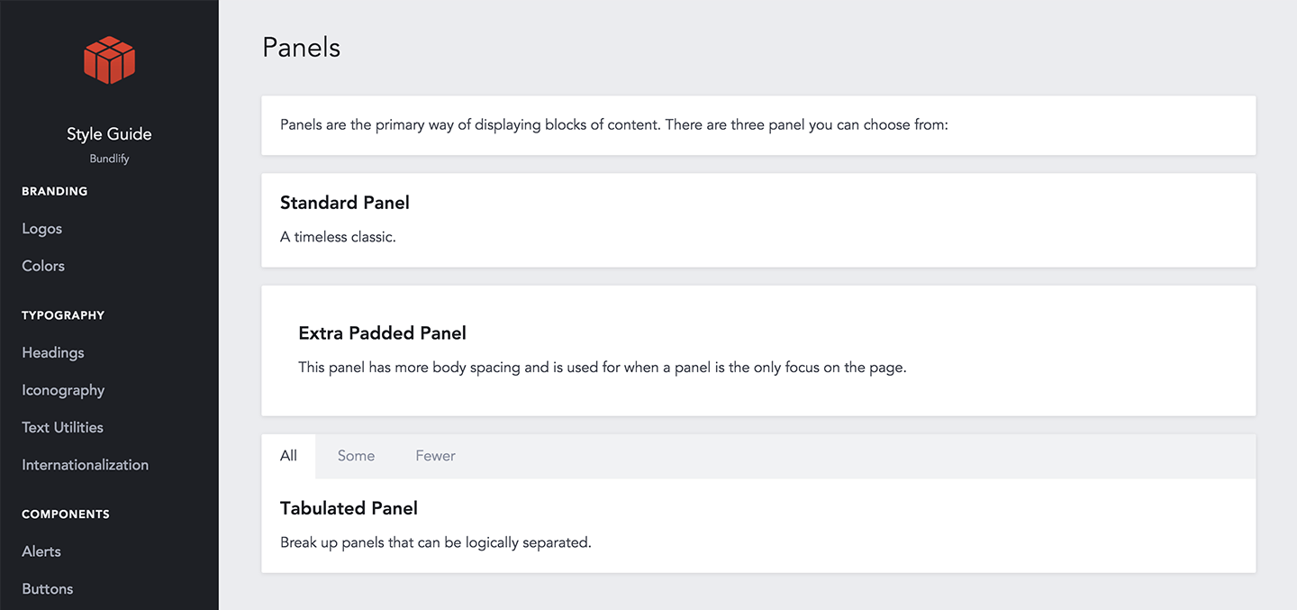
Panels
Panels are the containers that house your components within a template. You may or may not use panels.
All of our panels have a white background, 2px border radius, and a light box shadow to make it stand out on the page.
Navigation
Your navigation should be documented and laid out on the style guide.
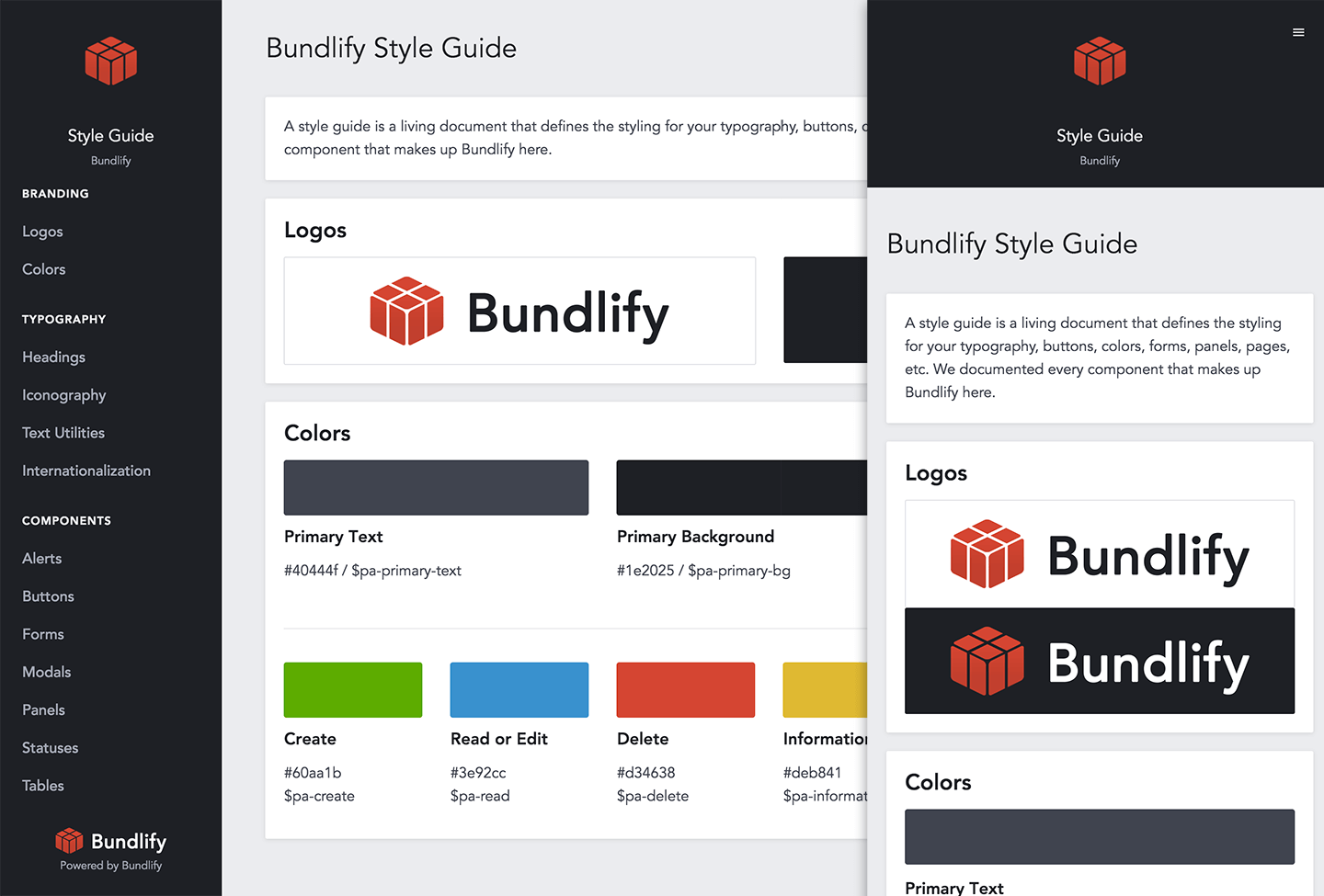
We defined our navigation with the style guide itself. Menu on the left that expands along the top on mobile.
Layout
The general layout of your pages should be documented for each page type.
As a SaaS app, every page is built with panels to house the data, forms, and actions.
Establish tables, alerts, icons, modals, etc.
Now that you have the basic components and your base functionality defined, design your tables, alerts, icons, and modals as needed.
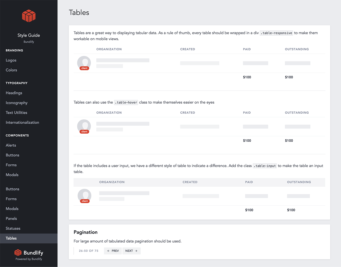
Tables
Tables are still the best way to display and manage data. Include bulk editing, filters, navigation, table footers, etc.
We have basic tables for now. As we build bulk editing and other search filters, we'll add them to the style guide first.
Alerts
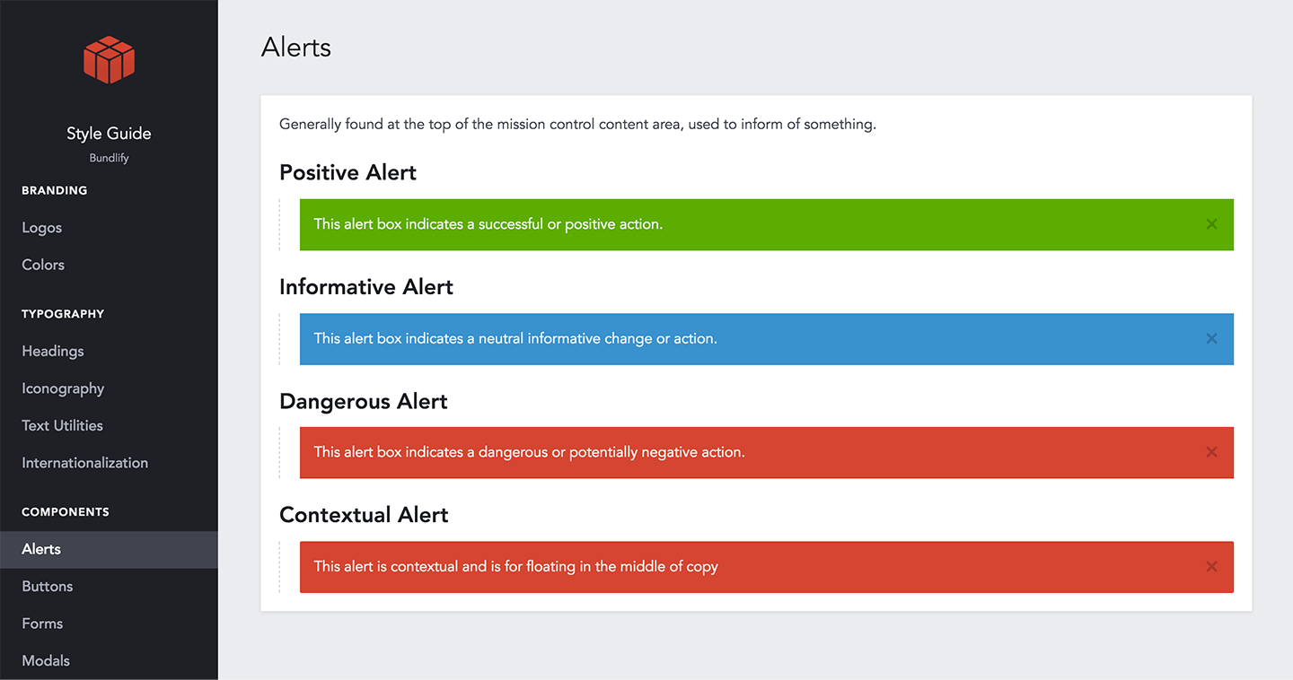
Alerts are displayed when you log in, log out, complete a form, etc. They can be displayed at the top of the page, bottom of the page, or contextually in the form.
We have positive, informative, and dangerous alerts. We'll also add a sticky alert for the free trial.
Icons
You can use an icon font like FontAwesome, but that'll load hundreds of icons that you'll never use.
We used Fontastic to create a custom icon font with the only 14 icons we use.
Modals
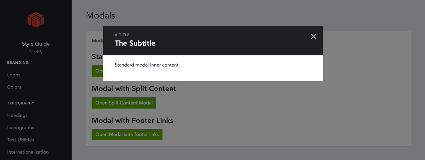
If you use modals for signups or notifications, make sure they're designed and function consistently.
We have three modal types.
Set rules for internationalization, text utilities, and blank states.
If you've designed and documented everything above, that's great! We've chosen to also document internationalization, text utilities, and blank states.
Internationalization
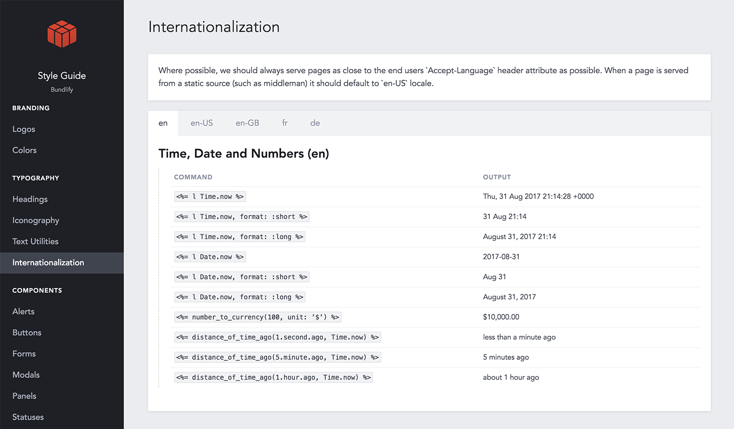
Different countries have different ways of displaying times, dates, currencies, and languages.
We've laid a strong foundation and are in the early stages of internationalizing our SaaS app.
Text Utilities
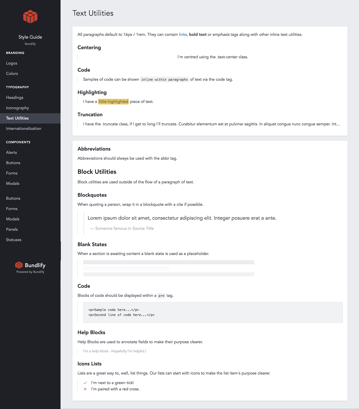
In addition to body copy, your app will likely include different types of microcopy.
We've designed blockquotes, highlighted text, code samples, help blocks, and icon lists.
Blank States
Blank states are what your users see before they've added any data to their accounts. They're designed to trigger an action.
We've designed our blank states as empty tables.
When you should start documenting your style guide.
As early as possible.
Before building our MVP, we started with live mockups and built the style guide based on the design. Here are a few of the pros to waiting until you have a base design:
- Typography based on real copy - You can see real headlines next to the body copy and microcopy.
- Forms and buttons are contextual - If you design a button that's way too big for the form or page, you'll be able to quickly adjust it.
- Complete inventory of components - If you design the components first, you might not end up using much of what you design.
If you decide to design first, document later, be mindful of what you're designing. Keep the number of components to a minimum.
Documenting your style guide with online tools and templates.
Now that you're convinced that you need a style guide and you're in a good place to get started, these are the tools I'm happy to recommend.
Ordered by non-coder friendliness to completely customizable:
- Frontify - Best for maintaining the visual and branding components of your style guide.
- Pattern Lab - Built custom for following atomic design principles.
- Fabricator - Awesome for building and maintaining a UI toolkit.
- Knyle Style Sheets - Best for maintaining CSS components and variables to generate a living style guide. Used by GitHub.
- Mountain View - The framework we used and customized because it's built for Rails.
The tool you choose depends on who is going to own it.
If non-technical, go with Frontify or Pattern Lab. If you're a SaaS company with at least a technical co-foudner, choose Fabricator, KSS, or Mountain View.
Get inspiration from these style guide examples.
If you're looking for inspiration, check out these examples:
- Lonely Planet's Style Guide - A comprehensive UI/UX style guide for a consumer-facing brand.
- MailChimp's Pattern Library - After two full redesigns, this is MailChimp's move to a more responsive, nimble, & intuitive app. Also check out their Voice & Tone guide.
- Help Scout's Style Guide - Help Scout's answer to building a cohesive and harmonious brand.
- GitHub's Primer - The CSS toolkit that powers GitHub's front-end design.
- Bundlify's Style Guide - The result of all the work we've done to define and document a style guide for our SaaS app.
Remember, these are living style guides which are meant to be added to and maintained over time.
Style guides are living documents.
Our style guide has lots of room to grow. As a two-person company, it's perfect for what we need now. As we grow, we'll update it with:
- Click to Copy - Adding the click-to-copy functionality to colors and components.
- Code Samples - HTML and Ruby code to copy under the individual components.
Plus, as we grow the company and better define the brand, we'll also add these sections to the brand style guide:
- Imagery and Visuals - Rules for graphics, illustrations, and blog images that get shared across social media.
- Voice and Tone - To provide a consistently friendly tone on landing pages, emails, social media updates, alerts, and press material.
- Brand Vocabulary - Defining a common list of internal vocabulary for the features and components.
- Customer Avatar - Building a persona for the target customer.
- Mission, Vision, and Values - The core beliefs and principles that guide all decisions.
Having a public-facing style guide is nice because we're responsible to it.
Always in your mind. One place, everything there.
It's a single source of truth for your company.

